Music Sharing App for DJs
Overview
With this project, I aimed to create a music sharing platform for DJs and independent artists. Social media platforms such as Instagram, Twitter, and Facebook are generally image or text based. I noticed that there was a missing niche of sharing audios/music. There has been discourse around whether or not Spotify could be considered a social media platform but I personally do not see a strong social aspect in their app. This app idea would be used to tap into this liminal space and provide a platform where musicians can share their creations and create a space for communities to thrive.
Music Sharing App for DJs
Music Sharing App for DJs
Overview
With this project, I aimed to create a music sharing platform for DJs and independent artists. Social media platforms such as Instagram, Twitter, and Facebook are generally image or text based. I noticed that there was a missing niche of sharing audios/music. There has been discourse around whether or not Spotify could be considered a social media platform but I personally do not see a strong social aspect in their app. This app idea would be used to tap into this liminal space and provide a platform where musicians can share their creations and create a space for communities to thrive.
Research
I conducted a competitive analysis on similar existing products on the market today such as: Youtube Music, Soundcloud, and Spotify.
To understand what kind of platform independent artists are looking for, I conducted surveys and interviews in an attempt to empathize with their needs.
What does the music space do well currently?
Can you describe your frustrations with the current music sharing apps?
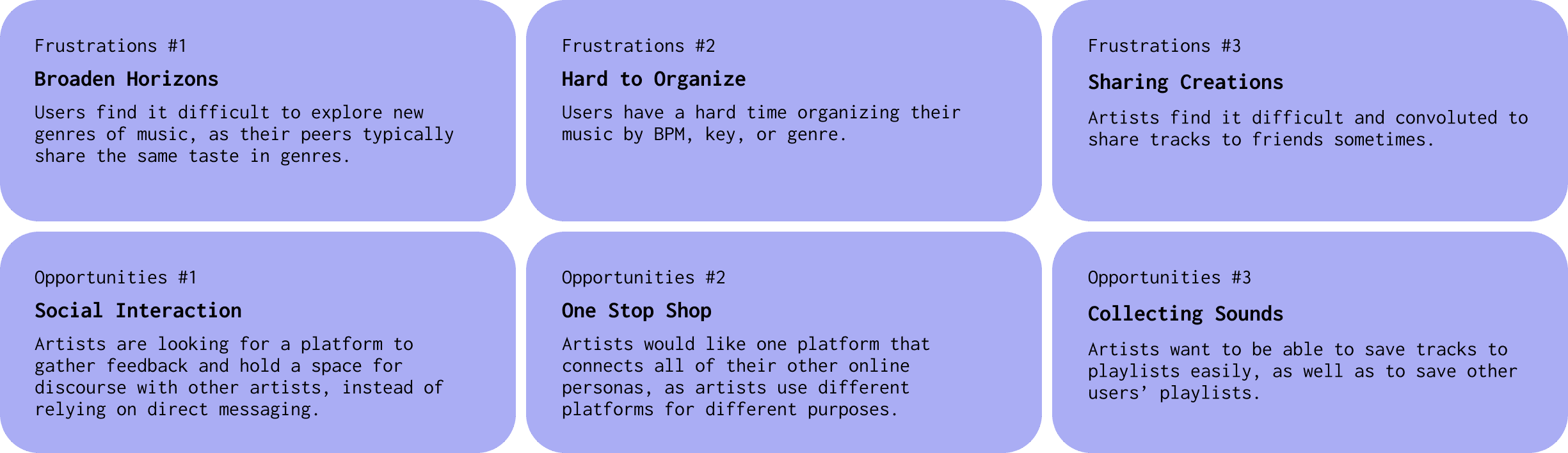
Opportunities and Challenges
Ideation
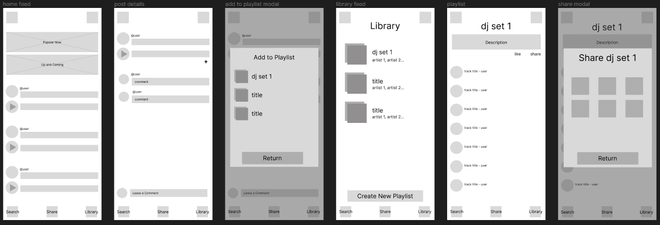
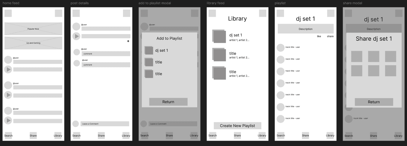
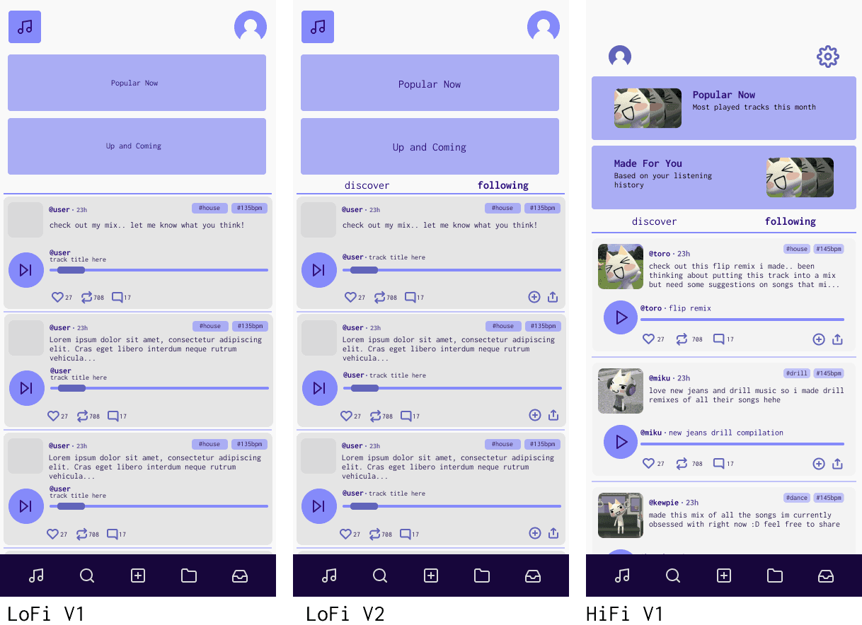
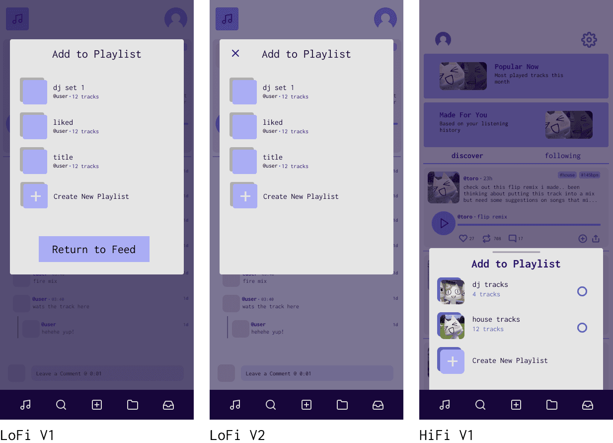
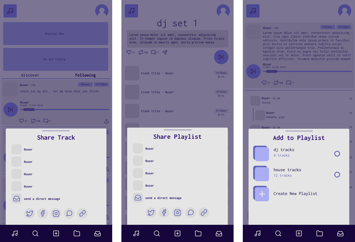
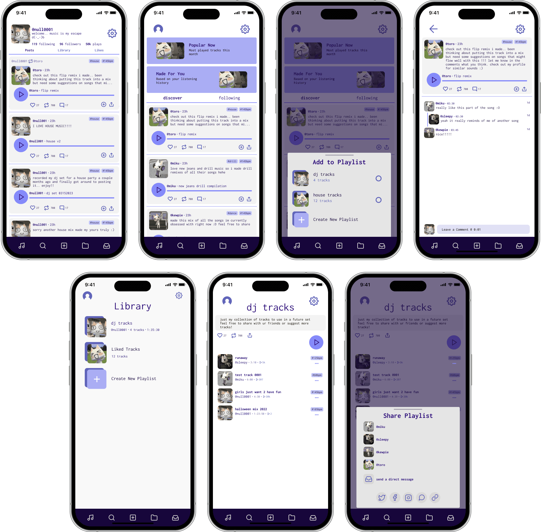
I began designing low fidelity wireframes with a simple user flow in mind: adding a song to a playlist and then sharing the playlist.
Ideation
I began designing low fidelity wireframes with a simple user flow in mind: adding a song to a playlist and then sharing the playlist.
Testing
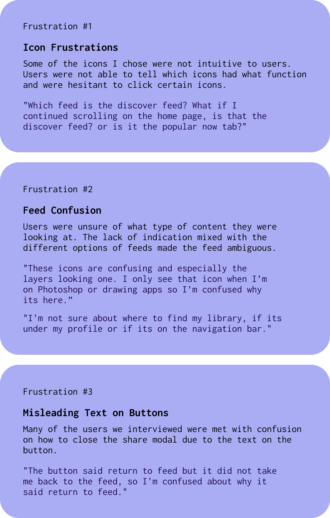
I conducted 5 moderated interviews with users who were avid music listeners and recorded their click paths as well as some notable quotes. Some findings of this usability study can be summarized in three common frustrations:
Testing
I conducted 5 moderated interviews with users who were avid music listeners and recorded their click paths as well as some notable quotes. Some findings of this usability study can be summarized in three common frustrations:
Icon Changes
The icon used for adding a track to a playlist was not intuitive to users so we changed it to something more widely used. Icons that I personally thought evoked a straight forward function were not received positively with users in testing.
I realize now that although there are creative liberties that designers can take, sometimes the best solutions are ones that are conventional and long established.
Feed Confusion
We added a tab that states which “feed” the user has selected to minimize confusion on what the user is browsing. Features that are obvious to me, because I’m the one designing it, are not always obvious to the intended user and must be explicitly stated.
Feed Confusion
We added a tab that states which “feed” the user has selected to minimize confusion on what the user is browsing. Features that are obvious to me, because I’m the one designing it, are not always obvious to the intended user and must be explicitly stated.
Misleading Text on Buttons
Many of the users we interviewed were thrown off by the modal button. They were mainly confused on why the button would return them to the feed, when they simply just wanted the modal to go away after selecting a playlist to add the track to.
At first, I opted to remove the button completely and to replace it with a simple x button on the top right, which seems to be more ubiquitous to users. However, as I kept iterating, I found that repeating a “share sheet” looking interface would maintain visual consistency throughout the app.
Takeaways
This project was an excellent learning opportunity in regards to user research. Keeping in mind the user needs and what pain points need to be addressed, I was able to create a prototype that allowed for easy sharing and curation of music.
Next Steps
With more time, I would like to explore creating screens for:
Uploading and posting a track
Onboarding screens
Direct messages
Search and filters
Next Steps
With more time, I would like to explore creating screens for:
Uploading and posting a track
Onboarding screens
Direct messages
Search and filters